Here are two previous student digipaks that I thought worked well. I am going to list the strengths and weaknesses of each below.
1)
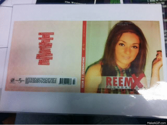
Strengths:
- has a constant colour palette; red and cream
- includes all elements needed for a digipak
- maximum of 2/3 fonts
- nice colour fade
- nice layout
- the layout of the track list works well with the rest of the work
Weaknesses:
- inside panel seems rushed because of all of the pictures stuck on
2)

- nice use of filter
- font consistent throughout the ancillary products
- blue and white is the main theme throughout the digipak and advert
- layout works well
- writing is a little hard to read sometimes (tracklist)
No comments:
Post a Comment