Thursday, 19 December 2013
Ancillary Research: What is needed on a digipak
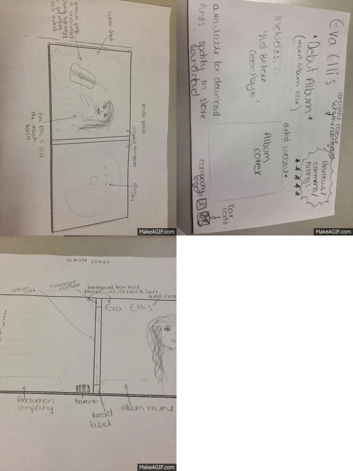
I came across some worksheets from the summer and I found a paper with the key elements needed in a digipak. Having this with me would help me remember everything I need to include and make sure I don't forget anything.
Tuesday, 17 December 2013
Ancillary planning- shortlist of photographs & final plan for cd
Ancillary Planning - Ancillary Pitch
Here is my ancillary production pitch for my digipak and advertisement
ANCILLARY PLANNING: Pitching Digipak & Ad Ideas
outline how many panels your digipak will be
where magazine ad will be placed
where i got ideas from
Sunday, 15 December 2013
Ancilary Planning: Mock Up of Advertisement
Here's a mock up of what I want my advertisement to look like:
It's was meant to be in the rule of thirds where in the first third you'd see most of the writing and the other two thirds you'd see the picture of the album, the artist name and the album name. Unfortunately, when it came to drawing it out, it didn't really come out that way. But all that I can say is use your imagination and picture it in the way I described it to be :)
Friday, 13 December 2013
Ancillary Planning - Mock Ups of the Digipaks
I made two versions of my mock up;
One sketched version
Outside
Inside
and another one with the actual picture stuck on
Outside
Inside
Thursday, 12 December 2013
Ancillary Planning: Shortlist of Pictures
After a WHOLE LOT OF NARROWING DOWN, I've finally settled on a few pictures that I like and may use for my digipak. I wanted a close up picture of the artist and I think I've selected the best out of the lot.
I've chosen some from both the internal location and external location because I simply loved them in both locations!!
Audience Feedback - Post Cinema Screening
After watching the premier of our music videos we grabbed a few members of the audience after all the excitement and cheers, we went back to business and asked a few questions put a few of our inputs to the test (mise en scene, male gaze etc) to find out if they made an impact.
We also asked further questions about how we can make the rest of the artist/branding/digipak successful, whilst we had the chance to find out from REAL people, giving more insight than simply our research.
Take a look at the video below to find out what the viewers thought! Enjoy
To watch the video yourself and find out your opinions click here! >> VIDEO :)
Wednesday, 11 December 2013
PREMIER! - 10.12.2013
Cinema Screening of Just Before Goodbye
- Group 28's hard work proved to pay off
On the 10th December 2013, we all placed our cameras, headphones, and hard-drives back into the peaceful air of the technicians office. After taking a breath of relief for the first time in weeks, we all headed over to Screen On The Green to watch what we had been working on vigorously for what seems like a lifetime. We had an amazing time, an amazing response, and an amazing outcome on the big screen! Finally - The video we were producing, was... produced.
Watch video below to see the amazing screening and audience reaction!
Or... Click link below
Ancillary Planning: Influences from real digipaks
When it came to planning and designing a digipak for our artist, I knew what kind of idea I had for it I just wasn't sure if it would be seen as too simple. Once I researched more into different styles of digipaks and the style that I was going for I felt more confident with the idea I initially had. Three digipaks particularly stood out to me and I think I will be taking a few ideas from them for my own.
Again here on the front panel you see a simple textured background with the artist on the front of it. I like this because again you focus solely on the artist as she is what stands out. Also I like the neutral colour theme on it. It seems more feminine and elegant which is something that I may use.
I decided to look into some Taylor Swift digipaks because from the audience feedback when I had asked about what they would expect, they said they'd expect to see something that you'd get from Taylor Swift as that's who they associated our artist with. Again I like this one because of the simplicity of it (as you can see there's a trend going on here ;)) because it looks more girly and feminine. I also like the creams and beiges used in this. I also like the way her hair blows in the shoot. We shot a few pictures of our artist with her hair blowing in the wind. I wasn't so sure of this at first but after seeing this digipak I am starting to warm to it and I may use one of those for my own one.
1. Mariah Carey - Charmbracelet
I like this one simply because of close up shot of her face and the simplicity of it all. The main idea of it is to the sell the artist and that is essentially what is going on here as there is nothing but Mariah to focus on.
2. Nicole Scherzinger - Her Name Is Nicole
3. Taylor Swift - Fearless
Tuesday, 10 December 2013
Media Departments Music Video!!!
The media department had surprised everyone with a video of their own. Here's a video made of the screening of their video with everyones reactions towards it.
Enjoy!
Music Video Screening - finished product at the cinema
I'm glad to say that nothing went wrong today with our. No surprise bits where the footage goes out of sync!!
It felt a bit weird seeing our work on the big screen but I can honestly say that I'm proud of our work and how it turned out. All of our hard work and efforts have certainly paid off.
Here is the reaction from the audience while they were watching our music video!!
Monday, 9 December 2013
Ancillary Planning - Few Photos From the Photoshoot
We had a GREAT day taking pictures. By the end of it all we managed to get over 500 pictures (when in reality we only need two or three..)
Here's a preview of some of the pictures we took:
Music Video Screening at The Screen on the Green Tomorrow
Time for the screenings almost here and I can honestly say that I'm SOOOO EXCITED!!! But also anxious at the same time because throughout the whole editing and filming process we were slightly behind so we might not have had enough time as the other groups may have had to do better edits and effects.
Another thing that I'm anxious about is that I've heard about another group whose video is quite similar to ours (with the guitar, green scenery, cafe scene) and I hope its not too similar that it would make people think we copied one another because I can assure you we did not!!
Other than that, I'm really excited to watch everyone else's music videos. I know that they're already up on Vimeo but I don't want to ruin it for myself when it comes to watching it on the big screen. I have no idea what to expect with them (apart from our classes rough cuts) and I think that's a good thing because then I can see first time round what song they have chosen and what they did with it.
Sunday, 8 December 2013
Saturday, 7 December 2013
Ancillary Planning: Costume & Props
We felt that the costume we chose would appeal to our main target audience (teenage girls) as it is something that they would most likely wear and it is something that is seen as trendy in that age rage. We wanted to make a clear connection between the music video and ancillary products so we decided that she should wear something similar to what was shown there.
Ancillary research: what to include in a digipak
A digipak should include the following information:
Front cover:
-Image of the artist
-Song
-album name-
Artist name (usually bigger than album title)
-Song
-album name-
Artist name (usually bigger than album title)
Spine:
- Artist name
-Song/album name
-Catalogue number
-Record company logo
- Artist name
-Song/album name
-Catalogue number
-Record company logo
Back cover:
-An image
-Track list
-Barcode
-Record company logo
-Copyright details
-Legal information
-Website address for artist
Friday, 6 December 2013
Music video views!
Our video has reached 213 views on Youtube so far! From posting it on social networking sites Facebook and Twitter I have made awareness of it.
Ancillary Research - Analysis of 3 Digipaks & Adverts from Our Genre
I have created a Prezi where I analyse three different digipaks; two from the same genre and one from a different one.
Gabrielle Aplin and Florence + the Machine are from the same genre as my artist (indie-pop)
Tinie Tempah is from a different genre (grime and hip-hop).
Ancillary Research: Producing a Practice Digipak
During our lesson we had practiced on making a digipak by sticking to the basic guidelines. For example:
- Album Name (Front Panel
- Artist Name (Front Panel)
- Picture of the Artist (Front Panel)
- Copyright info (Back Panel)
- Tracklisting (Back Panel)
- Barcode (Back Panel)
- Record company logo (Back Panel)
- Artist and album name (Spine)
- Catalogue number (Spine)
- Record comany logo (spine)
From the above, this is the digipak that I had produced using a picture of Taylor Swift.
Ancillary Research: Analysis of Previous Student Digipaks
Here are two previous student digipaks that I thought worked well. I am going to list the strengths and weaknesses of each below.
1)
Strengths:
- has a constant colour palette; red and cream
- includes all elements needed for a digipak
- maximum of 2/3 fonts
- nice colour fade
- nice layout
- the layout of the track list works well with the rest of the work
Weaknesses:
- inside panel seems rushed because of all of the pictures stuck on
2)
- nice use of filter
- font consistent throughout the ancillary products
- blue and white is the main theme throughout the digipak and advert
- layout works well
- writing is a little hard to read sometimes (tracklist)
Thursday, 5 December 2013
Music Videos Have Been Uploaded!!
Our video has finally been uploaded onto Vimeo alongside all the other music videos made by the other groups this year. Here is our video:
Sit back and enjoooyyyy B)
28. Korima, Eli, Kellie, Sian from 283goswell on Vimeo.
Tuesday, 3 December 2013
Extra Blogging by Kellie and Eli
Kellie and Eli are staying behind to plan our CD cover design ideas.
We used a grid to organise our initial ideas and visualise what it will look like
Subscribe to:
Comments (Atom)


